During my work T-Labs, I participated in the data visualizations for Telekom’s family plans, helping users understand their spending and usage across accounts. I contributed mockups, prototypes, and visualization examples.
_______________________________________________________________________________________________________________
Overview
Context
It was an ongoing project: there were already some frameworks and basic prototypes and a team composed of researchers, developers, and designers.
Objective
Create a new visualization of the contracts & user data.
What did I do?
> I worked closely with the research team to iterate and develop a version for the Usability Test.
> Designed user flows, dashboards, and interactive visual elements
> Designed user flows, dashboards, and interactive visual elements
Result
Delivered a functional prototype and assets to the development team.
Client
RAMPmedical
RAMPmedical
Role
UX & UI / Service Design / Design Research
UX & UI / Service Design / Design Research
Duration
2020 (One year)
2020 (One year)
Target
Medical Doctors & Practices (B2C / B2B)
Medical Doctors & Practices (B2C / B2B)
Team
Me (the only designer)
CEO
Sales
2 Technical Developers (Frontend + Backend)
CEO
Sales
2 Technical Developers (Frontend + Backend)
Medical Advisory Board:
2 Main Medical Doctors
2 Main Medical Doctors
First Ideas
I started working on the general concept.
After a usability test, the team understood
that users wanted to visualize how they
(and the members of their family)
spend their money.
that users wanted to visualize how they
(and the members of their family)
spend their money.
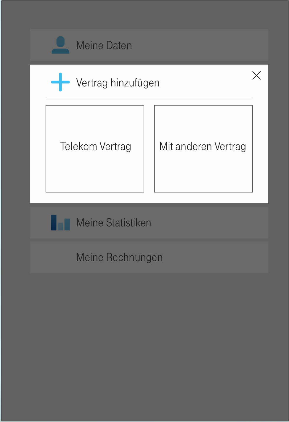
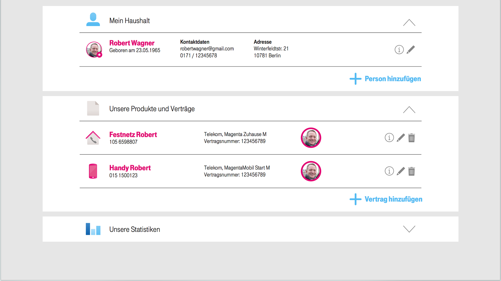
We first worked in flowcharts. Then, I moved to high-fidelity mockups and a working prototype, using the guidelines from Telekom.

Workflow:
In each step, we had a meeting about the concepts and how to evolve the prototype. The graph shows my usual process.
Adaptation & Statistics
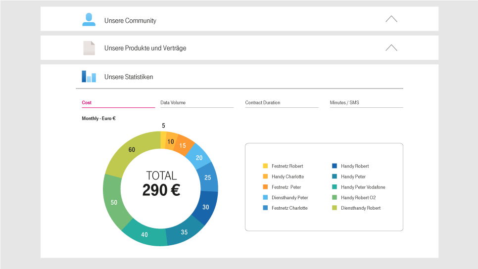
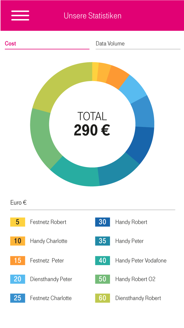
The usability test feedback was positive. As a result, we made some iterations and moved into the next phase: the adaptation for the mobile version and design of the dashboard.
From a starting brief that combined different contents, functions, and times, we made a benchmark to understand how other businesses communicated results to the final user.

Result
The project was presented during the Mobile World Congress in Barcelona (February 2018)
